Cloudy’s Chalkboard: Tracking the stars in your salesforce universe – Part 2
Last week we started creating a complex dashboard table that could help a nonprofit keep tabs on its most important donors. We created the report that will be the ...
Last week we started creating a complex dashboard table that could help a nonprofit keep tabs on its most important donors.
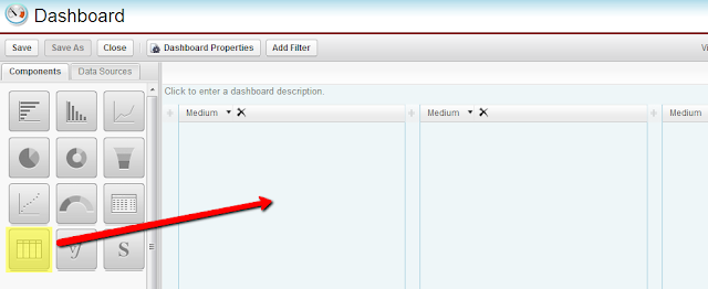
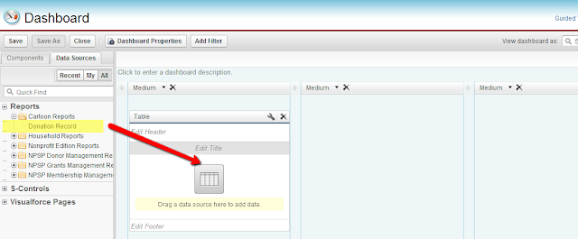
We created the report that will be the basis for the dashboard component. Today we will finish by actually adding it to the dashboard!
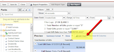
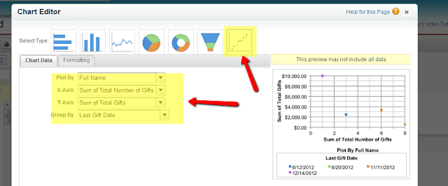
Choose a scatter chart as the type of chart, and on the chart data tab, set all four chart data fields to the meaningful groupings of your report, as shown:
**If you want to make the chart less prominent on the report itself go to the “Formatting” tab on the chart editor and choose to make the chart size “Tiny” and the chart location “Below Report”!**
Cloudy’s Chalkboard: Tracking the stars in your salesforce universe – Part 1)
 Congratulations! You have created a complex dashboard table that will allow you to keep track of important donor relationships that might be at risk. Consider scheduling this dashboard to refresh regularly, and/or have it emailed to interested parties automatically.
Following similar steps, you can create tables to track other parts of your business as well. If you would like help with your reporting and dashboards, Contact Us!


