Cloudy’s Chalkboard: Tracking the stars in your salesforce universe – Part 1
Who are your STAR clients? Are any of those relationships at risk? If you are using salesforce.com CRM, you understand the idea of Customer Relationship Management: you want to ...
If you are using salesforce.com CRM, you understand the idea of Customer Relationship Management: you want to track the relationships and transactions of your customers or constituents and gain a 360 degree view of your business. You know that you can look at a single contact record and see all of their information, including lifetime transactions, campaign involvement, and activity history.
But how do you leverage that information at a higher level?
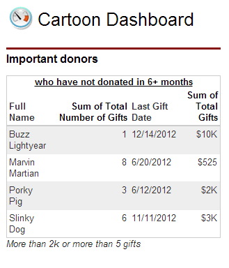
Let’s learn how to create a complex dashboard table that displays critical relationship updates at a fictitious nonprofit organization called Cartoon.org:
Cartoon.org puts a high value on two types of donors:
1) Those who have donated more than $2,000 in their lifetime.
2) Those who have donated more than 5 times in their lifetime, regardless of amount.
These donors have shown, either by the amount OR frequency of their donations, that they are invested in the mission of Cartoon.org: it would be unwise to let those relationships founder!
The head of development at Cartoon.org wants to see a table of these high-value donors who HAVE NOT DONATED in the last six months. She will use this information to target these donors with some special attention to make sure they don’t forget about their favorite charitable organization!
This two-part demo will show you how to create this report and dashboard for your organization.
Step 1: Create a new report
Go to Reports>New Report>Accounts & Contacts>Contacts & Accounts>Create
(“Accounts” may be renamed “Organizations” in your org!)
Step 2: Set Filters and Filter Logic
|
Standard Filters:
Show = All Accounts (/All Organizations)
Date Field = Created Date
Range = All Time
|
Custom Filters:
Total Number of Gifts >= 5
Total Gifts >= $2,000
Last Gift Date < “6 MONTHS AGO”
|
(**NOTE: You will probably need to adjust the custom filter values to reflect donation totals, donation frequency, and time frames that are meaningful to your organization!)
Filter Logic:
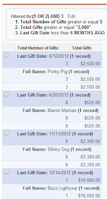
Adjust the filter logic by clicking the little down arrow next to “Filters” and select “Filter Logic”.
The default logic that is displayed will be “1 AND 2 AND 3”.
Edit it to be “(1 OR 2) AND 3” as shown above.
Step 3: Set Columns and Summarize
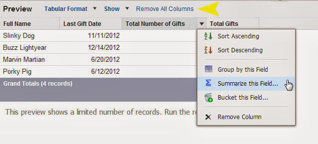
You can quickly clear the default columns by clicking “Remove All Columns” Link
Add the four columns we need for this report:
Name, Last Gift Date, Total Number of Gifts, and Total Gifts
Summarize the two “Total” columns:
Hover over the column header, click the down arrow, select “Summarize this Field” and click “Sum” on the dialogue box.
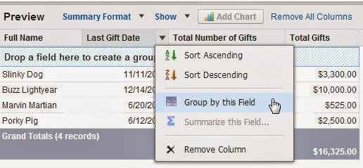
Step 4: Add report groupings
Group by “Last Gift Date” and “Name“:
Hover over the column header, click the down arrow and select “Group by this Field” for both columns.
Run the report; it should look like this:
Step 5: Save your report
Click “Save” and save your report with a meaningful name and description.
* * * * * * * * * * * * * * * * * * * * * * * * * * * * * * * * * * * * * * * *
This report is ready to be shared
with your development team:
These are your most important at-risk donors.
Make a plan to follow up with them!
* * * * * * * * * * * * * * * * * * * * * * * * * * * * * * * * * * * * * * * *
Tune in next week to create a handy dashboard component with this information.
If you would like help creating more meaningful reports and dashboards for your organization, Contact Us!
Cloudy Cumulus is part of Redpath Consulting Group, based in Minneapolis, MN (c) 2012


