How to Create Nonprofit KPI Dashboards with Examples
Dashboards can’t function without data, and neither can your nonprofit. However, too much data can also make dashboards irrelevant. As Salesforce Nonprofit Cloud’s functionality has increased, organizations have migrated more and more of their important data into the solution. While this is great for powering valuable insights, the influx of information can also make it difficult to gain a succinct overview of your data.
To keep your nonprofit’s dashboards relevant and useful for analyzing key data, you need to create customized options. In this short guide, we’ll provide tips for building custom Salesforce KPI dashboards and explore a few nonprofit dashboard examples to demonstrate how they can drive growth for your operations.
What is a nonprofit KPI dashboard?
Nonprofit KPI dashboards are visual displays of your organization’s most important data points. Whether they’re created in Salesforce, another platform, or even a simple spreadsheet, these dashboards can provide you with important insights into your data.
Custom nonprofit KPI dashboards are designed to help you monitor, track, and learn from your organization’s KPIs (key performance indicators) in real-time, enabling you to see all the information you need at a glance. Some common nonprofit dashboard examples include fundraising dashboards and program delivery dashboards.
How to create nonprofit KPI dashboards
After implementing Salesforce or another comprehensive CRM for your nonprofit, follow these steps to create your own custom nonprofit dashboards.
1. Define your key results areas and choose KPIs
The most important part of customizing Salesforce dashboards is to make sure the information you include aligns with your organization’s key result areas (KRAs) and goals.
Choose the most important metrics for your nonprofit to track, then design your dashboards around those KPIs. Thoroughly define those metrics and determine how you’ll report on them before you begin to visualize them with dashboards. That way, you can start tracking important information and customize dashboards to address your organization’s most pressing needs.
2. Map out the donor journey
The most effective nonprofit dashboard examples are those that offer valuable insights into all aspects of your operations and processes. One way to get those insights is to use a dashboard to map your donors’ journeys with your organization.
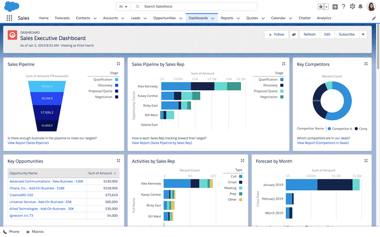
Take inspiration from the ways that companies meticulously track their customers’ journeys through their sales processes. While the terminology you use may differ, try to customize dashboards to account for every step in the donor journey. Explore this dashboard example to see how a company might track its customer journeys:

You can also make your dashboard more robust by integrating certain tasks and processes. The more tasks you integrate into your dashboard, the less time you’ll have to spend switching between records or list views. It’s a simple change, but it’s an effective way to improve efficiency and productivity.
3. Create alignment around your nonprofit KPI dashboards
Each team within your organization should have its own dashboard to track projects and campaigns. Not only will this make customization more effective by aligning the dashboard with each team’s individual goals and tasks, but it will also increase buy-in among nonprofit staff members.
Once you’ve set up your dashboards, make sure to share them with all team members. This will facilitate collaboration, unlocking the true potential of your nonprofit’s data.
4. Make your dashboards accessible on mobile

Your nonprofit’s staff aren’t tied to their desks, so your nonprofit KPI dashboards shouldn’t be either. With the Salesforce mobile app, your team can instantly access a real-time view of their performance metrics on the go with a simple tap.
If you’ve been a fan of building dashboards in Salesforce Classic, Salesforce Lightning offers several key advantages. The Salesforce mobile app works seamlessly with the desktop version of Lightning Experience, so users can switch between the two without missing a thing.
5. Update and iterate
Creating custom Salesforce KPI dashboards is not a one-and-done endeavor. Once you’ve designed dashboards for your nonprofit, note any challenges your team has with them and specific improvements you can make.
As your organization’s needs and data change over time, so should your dashboards. Regularly evaluate your nonprofit dashboards to ensure your KPIs are consistent and up to date, but avoid making changes so often that your team gets frustrated or confused about what metrics are most important. Throughout the process of iterating on your nonprofit KPI dashboards, gather feedback from your team and make changes as necessary.
Consider partnering with a nonprofit Salesforce consultant, as well. These professionals can provide specialized Salesforce support and identify ways to improve your dashboards based on your unique needs.
Nonprofit dashboard examples in Salesforce
You can create many different, highly customized nonprofit KPI dashboards within Salesforce based on your organization’s needs. A few common nonprofit dashboard examples include:
- Fundraising dashboards: Nonprofits are often most familiar with dashboards that monitor funds raised, average donation sizes, donor retention rates, and other important fundraising KPIs.
- Marketing dashboards: To evaluate your marketing campaigns’ performance, create a custom nonprofit dashboard that tracks metrics like email click-through rates, social media post conversion rates, and website traffic sources.
- Program management dashboards: See all of your data for a particular program in one place, including the number of program participants, attendance rates, progress toward program outcomes, and more.
- Service delivery dashboards: If your nonprofit provides specific services to beneficiaries, create a custom dashboard that monitors KPIs such as the number of community members served, services delivered, and volunteers involved.
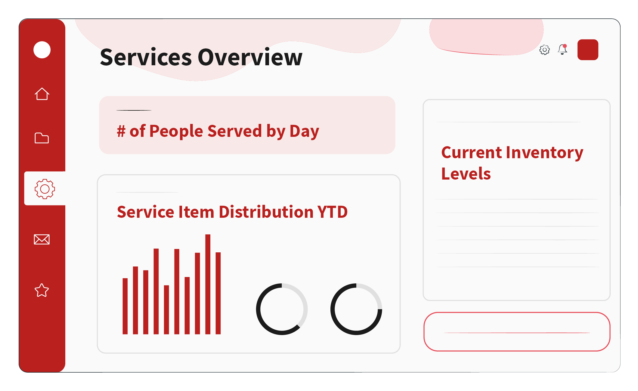
Get an idea of what these nonprofit dashboard examples might look like for your organization by exploring our example below. This service delivery dashboard example tracks the number of people served by the nonprofit, its current inventory levels, and its year-to-date distribution of service items.

Based on the data in this dashboard, your nonprofit might conclude that you need more food pantry supplies or that you’ve served more community members this week than you have in the last month. From here, you might investigate past months’ data and conclude that the end of the month is when community members are most in need of your services.
Create the best Salesforce dashboards for nonprofits with expert help
Every nonprofit has unique needs and goals, and they need custom dashboards to account for them. If you’re unsure how to get started or you’re having trouble navigating the Salesforce dashboard customization options, contact a member of the Redpath team. Our tech experts have years of nonprofit experience and know what it takes to provide you with the best Salesforce dashboards for nonprofits, custom-built for your organization.
For more tips on how to tailor Salesforce to fit your organization’s unique needs, download The Salesforce Customization Guide >>
With the rapid evolution of technology, Salesforce solutions are ever-changing and improving features. Contact our team for up-to-date information.


