Lightning Series #3: Functionality Gaps
As our team went through the testing process, we found several gaps in functionality (many of which are vital to our Salesforce org) that went beyond what we already knew to be problematic prior to testing the Lightning Experience UI. For instance, we knew that things like Big Deal Alerts on Opportunities, scheduling of report refresh, and inline editing from list views were not yet available in the Lightning UI; but as we went deeper down the rabbit hole we discovered other gaps as well. Salesforce has a very detailed article that documents key features that are not available in Lightning UI.
The following is a list of some of the items we discovered during our testing process that were not a part of the Salesforce documentation. This is not meant to be an exhaustive list of all functional gaps, but it does highlight some areas that could have a huge impact on your Salesforce org. All should be considered when deciding on whether or not to enable the Lightning Experience in Salesforce.
Functionality Gaps / Areas of Interest we Discovered:
- Google Doc Association – Users cannot associate a Google Doc to a record in the current Lightning UI.
- Editing & Deletion of Notes & Attachments – Once added, Notes & Attachments cannot be deleted through the Lightning interface. Attachment descriptions also cannot be edited.
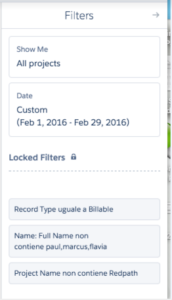
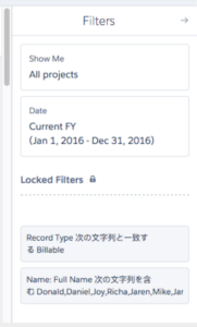
- Language Display – This was a perplexing one. Many of our testers, in seemingly random scenarios, noticed non-English language being populated on their screen (mostly in French and Mandarin). These instances only occurred in report and list view filters, so it wasn’t a monumental problem. When the screen was refreshed the issue was resolved, so not a huge issue by any means, but an oddity of note nonetheless. I like to surmise that Salesforce is secretly hoping to get their users to learn a new language. So, if you want to bone up on your French reading skills, the Lightning UI might offer you some unexpected assistance!


- Forced Reversion to Classic UI – We all were tasked with a mandate to stay in the Lightning UI for the duration of our testing, even when conducting our daily activities outside of Lightning functionality testing. One thing we found is that there were times when Salesforce compelled us to cheat on this mandate, against our will! Two specific examples are accessing Data.com and when using a Visualforce button. Data.com is available in Lightning, however we found that when you access Data.com Salesforce reverts from the Lightning UI back to Salesforce Classic. This also happened when one of our custom buttons was launched in Lightning UI.
- List View Navigation – Navigation through list views has changed in the Lightning UI. A user cannot specify the number of records to display per page and cannot navigate through pages with the arrow buttons that we all know and love in Salesforce Classic. We also found that users cannot navigate to a subset of records using the first letter of said records. This feature is available in Classic, but not yet available in Lightning.
- Notes & Attachments – Notes and attachments do not display across objects in Lightning UI. They only display on the object to which they were originally attached.
- Buttons – We found that several buttons in Conga and in Data.com were not functional in Lightning UI. Specifically Conga Reports was not working with Conga buttons, which caused our documents to be created with no data. In Data.com the “Clean” button is not available in Lightning UI.
- Log a Call – The Log a Call button in Lightning does not show the date and type fields when the action is launched. This is a limitation if a call is being logged as a date other than the current date and type is a required field in Salesforce Classic.
- Page Layout Navigation – Another interesting nuance we discovered is that page layouts can vary on records from one object to another. For instance the related list for an opportunity is on the right side. While on a custom object it is on the left. Also, chatter and activities operate the same and usually flip flopped from above. Further, in order to see the related list a user is required to click instead of scroll.
- Contact Roles – Contact roles for accounts are not supported in Lightning. However, we did find that is planning on introducing a new feature called Shared Contacts, which is meant to replace Contact Roles, hence their reason for not adding the contact roles feature to Lightning UI.
While we found many gaps in functionality, getting acquainted with the Lightning UI was a productive process for all of us. Once I became more accustomed with the new look and feel, I discovered I actually preferred several user features in Lightning. We also understand and want to acknowledge in this post that Salesforce will continue to ameliorate the Lightning experience. As such, we at Redpath will continue to monitor future releases for updates on supported features in Lightning.
Don’t forget to check out our last post about testing Lightning! Click here to read.
With the rapid evolution of technology, Salesforce solutions are ever-changing and improving features. Contact our team for up-to-date information.

