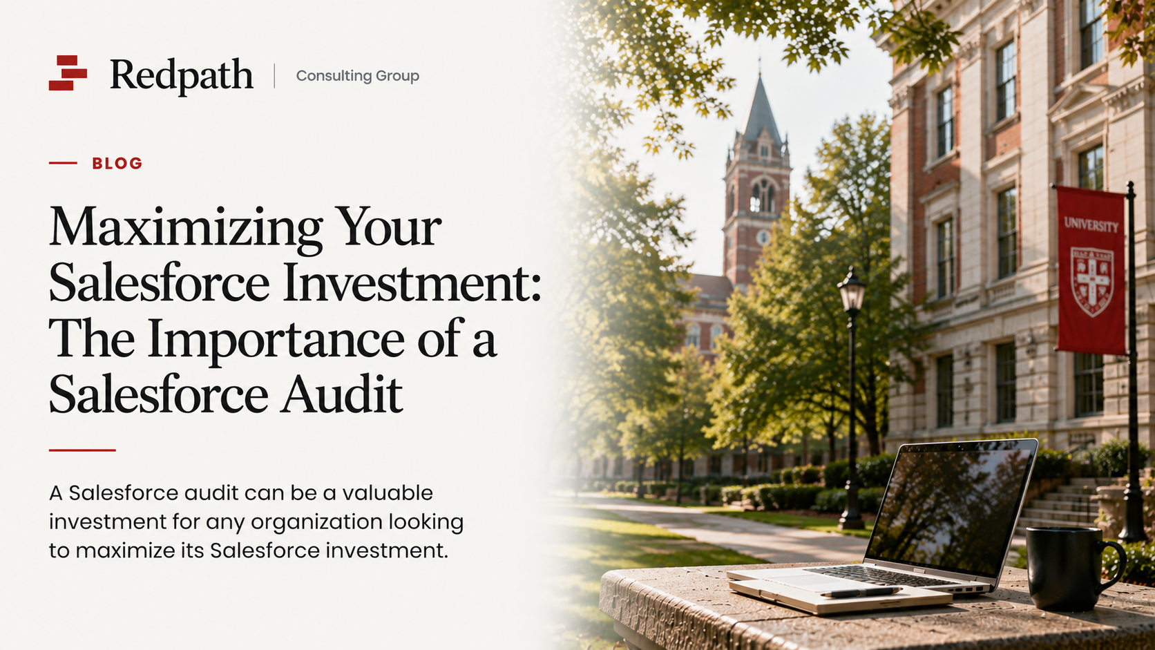
Data cleanup and maintenance made easy with Salesforce dashboards

Maintaining data quality is a universal chore that is pretty easy for any busy Salesforce administrator to overlook. There are just so many reports to click through. Fortunately, though, by creating a data quality dashboard, you can make the monitoring of your organization’s data quality much easier.

When building dashboards in Salesforce, many nonprofits tend to focus on more traditional sets of reports — those that track sales, fundraising and service metrics. However, dashboards are also a great way for admins to effectively stay on top of data quality and quickly see which areas need your attention.

Salesforce Dashboard data quality

Top data quality reports

Each organization will have different data quality priorities and pain points, but this is a good list for starting your dashboard.

Duplicate contacts report

Duplicate records occur in nearly every Salesforce org, whether due to web form issues, imported data or manual entry. But keeping your records clean and free of duplicates is more than just an internal housekeeping task. It is also critical for reaching your constituents and maintaining relationships with them.

Here are some key things to remember.

  • Salesforce doesn’t provide report types for duplicate records as a default, so you will have to set one up for every object you’re monitoring.
  • When I’m building my reports, I like to pull in email, phone and address columns to provide staff with a view that allows for quick assessment of potential duplicates.
  • Add a filter that only looks at sets with two or more records to avoid pulling sets that are already resolved.
  • I always add a custom field to duplicate record sets to indicate if the match is a false positive, and I add a filter to make those sets fall off the report.

Duplicate accounts report

Assuming you have a duplicate rule set up for accounts as well as contacts, this report will be a natural addition to your data quality dashboard. It will have similar fields and criteria to the report for duplicate contacts that I shared above — just accounts instead of contacts.

You might choose to have a few versions of this report if your account record types are very different. It may be helpful to have households separate from businesses, for instance, since they may have different fields you’d like to compare.

Contacts with potential email issues

Typos are a part of data entry life, and identifying those in emails as soon as possible is critical to avoid losing out on potential customers or donors.

This report looks at emails that contain text like the following:

  • Report Type – Contacts
    • Add a filter on the email field with the “contains” operator.
      • For instance, Email Contains: “gamil.com, hitmail.com, hotmil.com, .con, .cin” will turn up common misspellings of Gmail, Hotmail, and .com

Start with the common misspellings above, but then review your organization’s data as you may find others that are specific to companies and domains in your region.

Depending on your constituents, you may also decide you need to add some filters that provide exceptions to the filter I described above. For instance, if “Condon” is a common last name for you, you might add a filter that excludes contacts whose email field contains “.condon,” as to not catch those folks up in the search for the .con typo.

Empty household accounts

“Empty Household Accounts” is provided by default as part of Nonprofit Success Pack (NPSP), and it’s a report you might write up if you’re using another Salesforce cloud. This looks for accounts that do not contain any contacts, which occurs most commonly after merging duplicate contacts.

While most admins won’t find empty accounts as annoying as duplicate records, it’s a good practice to keep this report clean. It’s especially important in NPSP Salesforce instances, as households with no contacts get renamed to “Anonymous Households” — you don’t want to end up with a huge list of these.

Contacts with dummy data

How to build dummy data contact reportI first started creating these reports to clean up the test and fake accounts staff would create when testing functions. I then expanded the criteria to look for the kinds of dummy data that constituents often add to forms to bypass required fields. Here’s an example of a report to look for these records after they’ve outlived their purpose:

  • Record Type – Contacts & Accounts
    • Filter for contacts whose first or last name contains words like “Test” and “Fake”
    • Filter for email addresses that contain things like “test.com” and “fake.com”
    • Add filters for popular cartoon, show or movie characters if you know your staff like to use those for their testing.
    • You might filter for phone numbers that use only one digit, like “9999999999” and “1111111111”
    • You might also filter for common dummy Mailing Street lines like “123 Main Street”

While these filters will be good for catching records created for testing, you will likely also catch real contacts who are trying to bypass required fields. For instance, a real person who just doesn’t want to give you their phone number might give you legitimate information everywhere else but still enter their phone number as “999-999-9999.” Work with your team to determine how to care for contact records in a way that keeps your data clean while keeping legitimate records off of this report.

You also should include the created date in your report along with name, email, phone and other fields you are using as your potential fake criteria. If you see a lot of these records being created around the same time — especially if within the last couple of days — you should check with your colleagues to make sure their test is complete before you delete their data.

Lastly, create a report that looks for contacts with clear test names and clean these out periodically.

Combo contacts

If you have contacts created from web forms, you likely come across “combo contacts” regularly, where people try to combine two contacts into one record. For instance, a contact whose first name is listed as “Jane & John”.

While it is often seen as benign for household members to combine themselves in such a manner, it can cause real headaches down the road. For instance, in our “John & Jane” example, what if John passes away or the couple separates? Having separate contact records will make it much easier to know who is the main contact for the couple and how opportunity and interaction history should be credited, in addition to making it much easier to deal with situations like death and divorce.

For contacts and accounts, be sure to:

  • Filter for contacts whose first name includes “&”, ”+”, “and”
  • You’ll also have to create a counter filter for contacts whose first name includes “and” in a legitimate way, such as “Amanda” or “Mandy”

When you see contacts showing up on this report, staff will then create a second contact in the household for the latter half of the first name and then edit the original to take them out of the contact record. Staff will have to use their judgement in reviewing the original contact record and move over contact information that seems to belong to the secondary contact. For instance, if the original contact was “Jane & John Smith” and the email address is something like “john.smith@gmail.com”, then you should move that email address to John’s record since it seems clear that it doesn’t belong to Jane.

Salesforce’s data quality analysis reports and dashboards

In addition, you might consider installing the “Data Quality Analysis Dashboards” app from the AppExchange, a free Salesforce Labs app. The reports included are largely focused on making sure that certain fields are completed on key standard Salesforce objects. This can be a helpful start if you would like your team to better complete key fields on your records, but, since it only covers standard fields on standard objects, it will likely not be the end point on your quest for better data.

Putting together your dashboard

Once you have your reports written and/or gathered, you can simply add them to a dashboard. The dashboard allows your clean-up crew to quickly assess which reports need attention and which can be put off for another day.

My favorite component type for a data quality dashboard is the “Metric Chart” in Lightning, since it simply shares a number of how many records are meeting the criteria. I like to then adjust the segment ranges — both their color and size. You should talk with your team about which segment sizes makes sense for you. It will vary both on the amount of data you have and your team’s preference for how precise and clean your data should be. Here’s an example that gives us a “stoplight” pattern with a relatively low data quality threshold:

Salesforce report building with metric tiles

What do you think?

Many organizations will develop their own reports that look for things that are particular to their business or mission. Which reports have you introduced to benefit your business? I’d love you to share in the comments how you’ve organized your team for better data quality. And remember, if you ever have any other questions, don’t hesitate to contact us.

With the rapid evolution of technology, Salesforce solutions are ever-changing and improving features. Contact our team for up-to-date information.

Published On: May 27, 2020

About the Author: Elaina Buzzell

Elaina Buzzell is a Salesforce Consultant specializing in nonprofit organizations. She is a 5X certified Salesforce and Pardot consultant, with a mission to use her creativity, passion, skills, and experience to help nonprofits expand their reach and improve our world.